Game Over
- Final Major Project inspired by 80's Arcade Games and Graphics tied in with feelings of Computer-phobia at the time -
I have always been interested in technology and its advancements, especially the impact it’s had on our society throughout the years. My interest began with original arcade machines where I experienced carefree fun as a child when playing arcade games with my dad. I have always loved; the quirky designs, bright colours, clashing patterns and pixelated aesthetic of the original machines and find it fascinating to think back to the time they were created.


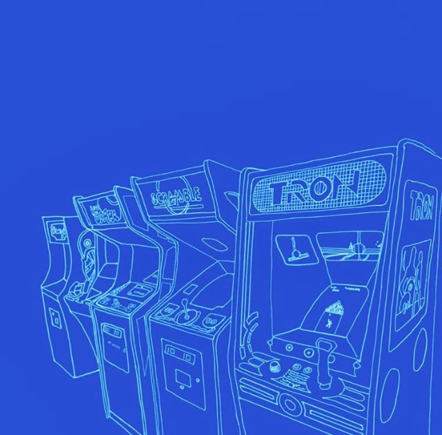


The late 1970’s and 80’s became a peak era for video arcade game popularity, innovation, and earnings. This time in history became known as ‘The Golden Age of arcade video games’ and was a time of great technological advance and design creativity with arcades becoming a dominant cultural force. I love that arcades became a community where anyone from any walk of life could go and feel part of something bigger than the common stresses of day-to-day life. “At that time, you’d see kids running towards arcades, asking their parents for a bunch of quarters to play with strangers and friends alike, anyone was welcome” (Green, K: 2017). People came together to enjoy themselves, have fun and escape.
However, with the addition of the personal computer, "computerphobia" captivated some consumers as the machine became ubiquitous in homes across England and America. This overwhelming wealth of new technologies swamped many people making them feel trapped.
These feelings felt in the 1970s/80’s can be seen today in our society, with technology advancing even further every day. Many people have already lost jobs to machines and feel swamped with technology taking over in all areas of our life e.g. banks, self-service checkouts and in restaurants where you order through a touch screen. I have noticed too that original, now ‘vintage’, arcade machines and games from the 70’s and 80’s are slowly creeping back into some restaurants and shops. Is this to offer solace in a time of disruption and remind people of a simpler time?
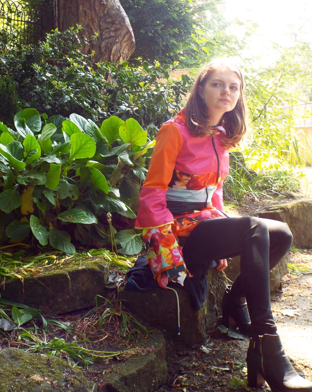
To create my womenswear collection I will combine the fun, bright and playful colours, shapes and patterns of arcades and their games in the late 1970’s and 80’s with over powering silhouettes. This is to reflect the feeling of computerphobia and being taken over by technology at the time as well as today.
However, with the addition of the personal computer, "computerphobia" captivated some consumers as the machine became ubiquitous in homes across England and America. This overwhelming wealth of new technologies swamped many people making them feel trapped.
These feelings felt in the 1970s/80’s can be seen today in our society, with technology advancing even further every day. Many people have already lost jobs to machines and feel swamped with technology taking over in all areas of our life e.g. banks, self-service checkouts and in restaurants where you order through a touch screen. I have noticed too that original, now ‘vintage’, arcade machines and games from the 70’s and 80’s are slowly creeping back into some restaurants and shops. Is this to offer solace in a time of disruption and remind people of a simpler time?
To create my womenswear collection I will combine the fun, bright and playful colours, shapes and patterns of arcades and their games in the late 1970’s and 80’s with over powering silhouettes. This is to reflect the feeling of computerphobia and being taken over by technology at the time as well as today.
Linda Leaver Competition
- Disability in Fashion -
For this competition I explored the challenges faced by young (age group 18-30) fashion-conscious wheelchair users. The inspiration for my collection came from Brutalist Architecture and I used my research to present innovative and bold design solutions in the form of a creative and wearable collection which specifically addressed the above issues.
I learnt a great deal from looking at how mainstream clothing can be adapted in appropriate ways. It encouraged me to really consider how I could design my own garments to fit a wide range of body shapes and positions. Through thorough market research and customer profile interviews I was able to gain a solid understanding of how some existing products had been altered. For example: fastenings like button stands were magnetic, keeping the appearance of a normal button up shirt, dropped shoulders and armholes helped comfort as the seams wouldn't then rub under the arm, a section could be cut out in the back panel of jackets to reduce perspiration build up for wheelchair users as well as a longer back rise and shorter front rise on jeans to aid in a more comfortable fit.
I learnt a great deal from looking at how mainstream clothing can be adapted in appropriate ways. It encouraged me to really consider how I could design my own garments to fit a wide range of body shapes and positions. Through thorough market research and customer profile interviews I was able to gain a solid understanding of how some existing products had been altered. For example: fastenings like button stands were magnetic, keeping the appearance of a normal button up shirt, dropped shoulders and armholes helped comfort as the seams wouldn't then rub under the arm, a section could be cut out in the back panel of jackets to reduce perspiration build up for wheelchair users as well as a longer back rise and shorter front rise on jeans to aid in a more comfortable fit.
Styling Elective
- Gender Stereotypes -
The first stage of the project was creating a mini advertising campaign within 48 hours based on our chosen inspiration consisting of Corinne Day, Francesca Allen, Hart & Leshkina, Mushpit Magazine and i-D Magazine. Once we had our idea, Gender Stereotypes, we had to organise, develop and produce our own stylistic fashion images. We put together a mood board to show how we’d: approach the shoot, style up the garments that we’d sourced and chosen and finally how and where the shoots would take place.
My group and I willing chose to organise 6 separate photoshoots instead of one, within the tight time frame of a week. Each shoot captured an area of our concept that we wanted to focus on which were: women in sports, men and emotion, girls and sexuality, male affection and finally women and body hair. Our final presentation consists of some initial inspiration, our magazine edit inspired by the Mushpit magazine layout and behind the scenes slides.
My group and I willing chose to organise 6 separate photoshoots instead of one, within the tight time frame of a week. Each shoot captured an area of our concept that we wanted to focus on which were: women in sports, men and emotion, girls and sexuality, male affection and finally women and body hair. Our final presentation consists of some initial inspiration, our magazine edit inspired by the Mushpit magazine layout and behind the scenes slides.
The Colour Project
- Light in Chinese Culture -
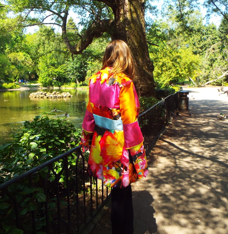
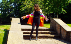
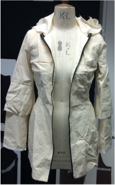
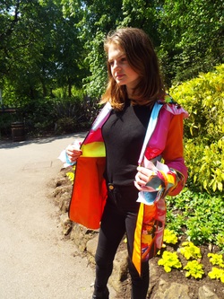
For this project I was asked to develop and design a 6 outfit capsule collection for Spring/Summer 2017 for a brand of my choice, mine being Emilio Pucci. I carried out extensive market research to identify and fully understand the brand I was designing for and developed, pattern cut and manufactured an outerwear piece from one of my designs.
I visited a light show in London celebrating Chinese New Year, which led me onto using that as my concept. Sparking my inspiration from the bright vivid colours and interesting shapes created by the lights and structures themselves. As Emilio Pucci are known for their use of bright colours throughout their products and are a very print heavy brand I began developing my own prints from my first hand images and taking the bright colours from my own fisrt hand images. Furthermore, as a luxury brand that uses silk across a range of their garments, I chose to have my own silk digitally printed with my chosen prints and colours.
I visited a light show in London celebrating Chinese New Year, which led me onto using that as my concept. Sparking my inspiration from the bright vivid colours and interesting shapes created by the lights and structures themselves. As Emilio Pucci are known for their use of bright colours throughout their products and are a very print heavy brand I began developing my own prints from my first hand images and taking the bright colours from my own fisrt hand images. Furthermore, as a luxury brand that uses silk across a range of their garments, I chose to have my own silk digitally printed with my chosen prints and colours.

|
|
|
|
The White Project
- German Expressionism. Architecture. Distortion. -


My first university project was called The White Project with the main focus on silhouette. With the starting word 'unbalanced' I chose to pursue my interest in architecture focusing on the off-kilter, distorted buildings in Germany during the German Expressionist period. This enabled me to explore the exaggerated shapes of the buildings during the movement and incorporate them into my designs.
